More accessible maps for websites
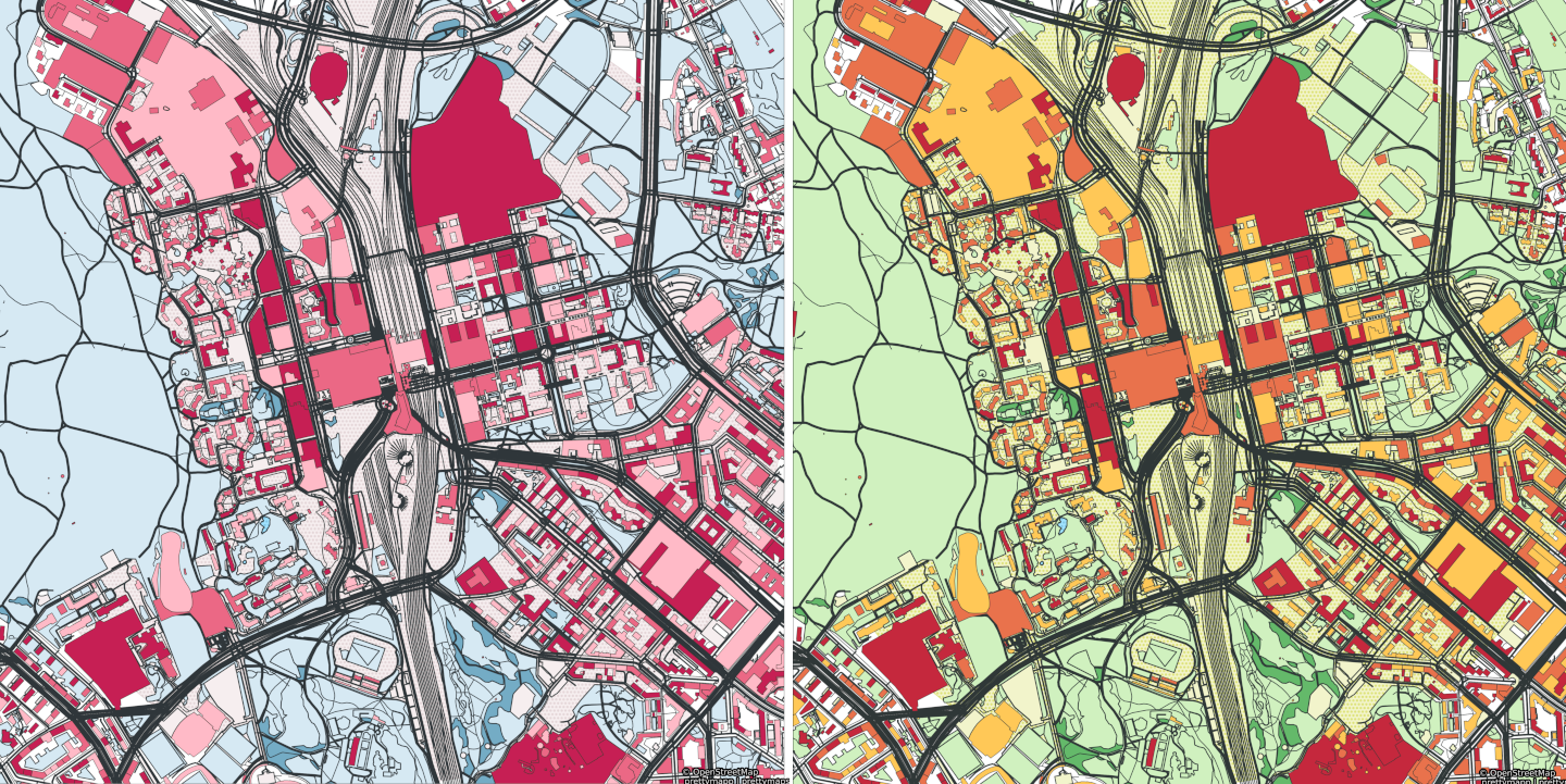
A side-by-side comparison of the same map of Pasila, Helsinki. The one on the left simulates how a person tritanopia (insensitivity to blue) sees it, the other shows how a person without color blindness sees it. Yet what else one should take into account in terms of accessibility?
More accessible maps for websites
This is an article that has been originally published in Finnish on Suomi.fi website. The Suomi.fi maps mentioned in the article is an Oskari-based map service, and the information presented here about the accessibility of maps can be used for maps of any other Oskari instance. The accessibility can be improved especially in map publications that are embedded on websites.
The original article can be found here.
What is accessibility?
Accessibility means that as many people as possible can use websites and mobile applications as easily as possible. Accessible information is easy to find, clearly presented and available through several different channels. Accessibility is not just a matter for people with disabilities or other special groups - it makes life easier for all of us.
In Finland, The Digital Services Act (which implements the Accessibility Directive (EU) 2016/2102 of the European Parliament and Council) does not require map services to be accessible. However, accessibility must be taken into account if the map is used for navigation or is a part of a website. In Suomi.fi maps, accessibility should be taken into account especially in map publications embedded on websites.
How do you improve the accessibility of maps published using Oskari?
Maps published from Suomi.fi maps are not fully accessible. As service administrators, we are constantly improving accessibility, but as a publisher, you can also make the map you have published accessible. Here are a few ways to do that:
1. Consider the need for the map
For someone who works with maps, describing a phenomenon on a map may seem like an intrinsic value. Of course, a map is the best way to present everything! However, take a moment to think about whether the map adds value to the text. Maps are not a mandatory addition to the website, they should be used with discretion instead.
2. Only show the essential
Think about what you want to communicate with the map. Show only the map layers relevant to the message on the map. A map showing school transportation routes, for example, should not include soil data or industrial facilities. You will get your message across to the user when the user does not get distracted when looking at the map thinking “Why is that map layer added here? Does it say anything essential about this matter?”. The user and you as the publisher of the map should focus on what is important in this particular context.
3. Place the object at the centre in an appropriate scale
Make sure that the items you want are visible on the map without the user having to search for the object either by moving the map view to another location or by switching to a different scale level.
Centre the map on the desired location and also leave the surroundings visible. No one benefits if the map shows, for example, only a school building or a health centre, but not the road that leads to it.
You can define the centre of the map by adding parameters to the link of the map you want to embed. They allow you to determine the centre point either using coordinates, address or property identifier. Read more about adding parameters in the user manual of Suomi.fi maps (section “Editing with the help of parameters”).
4. Take contrast and colours into consideration
The map loses its value if it is not understood. Particularly for visually impaired or, for example, colour blind people it is especially important that the contrasts are in order and that the colours stand out from each other.
In Suomi.fi maps, the presentation style of many map layers is predefined, but accessibility can be improved by selecting appropriate map layers. Among others, the National Land Survey of Finland’s background map or plain map often works better against the background of other map layers than the topographic map.
So be innovative and see which map combinations work best. Take a screenshot of the map, change the image to grayscale and test whether all relevant differences are still visible. I can tell you from experience that red dots on a green background do not stand out in this test!
5. Add a description of the map to the code
A map is not useful if you cannot see it. So remember to describe the essential contents of the map also in text format.
The screen readers used by visually impaired people know how to pick up an alternative description from the HTML code on websites. Remember to fill in the description and focus on the content of the text. If the description is only “The image shows the locations of the service points”, the essential content of the map, that is, where the service points are located, is not communicated to the visually impaired.
6. Provide a way to skip the map
Not everyone is interested in maps or it is difficult to understand a map even if all accessibility aspects had been taken into account. Therefore, it is important to offer the user the opportunity to skip the map. The content on the map is thus skipped, but if it is not accessible, it would still be skipped.
Additional information
Suomi.fi maps on the National Land Survey of Finland’s website
Requirements of the Digital Service Act on the saavutettavuusvaatimukset.fi/en website
Contact:
Riikka Kivekäs, National Land Survey of Finland, riikka.kivekas@maanmittauslaitos.fi
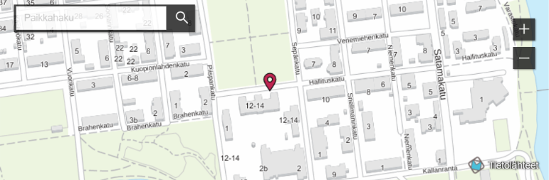
Photo: Kuopio service point on the National Land Survey of Finland’s website. The map has been prepared as a map publication from Suomi.fi maps which is an Oskari-based map service.